Responsive Web design
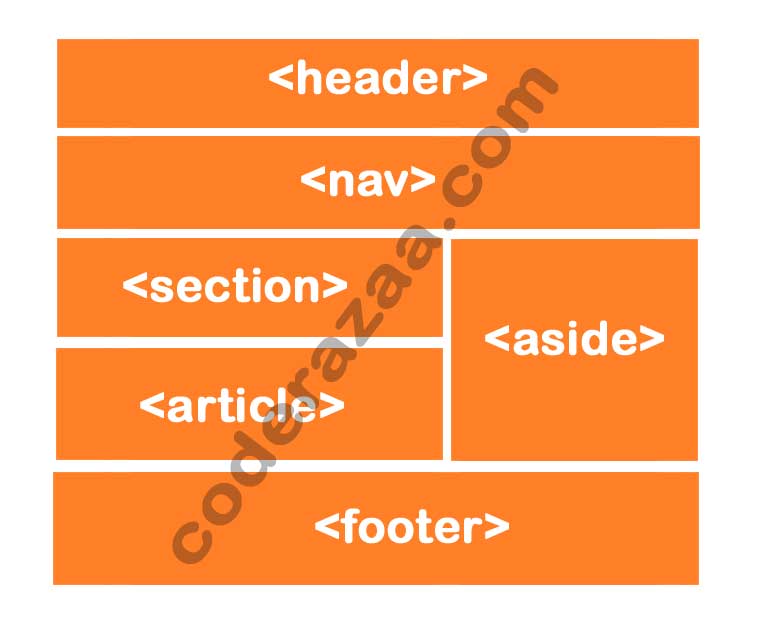
With responsive web design, you can make your website look good, right, and in the right place on all devices (desktop, tablet, smartphone etc.)
With responsive web design, HTML and CSS are used to move, hide, enlarge, shrink, or change the size of the content. The content will look good on any screen.
Let’s look at how the viewport is set
<meta name=”viewport” “width=device-width, initial-scale=1.0”>
Responsive Images
Responsive images are those that can be resized well to fit any browser size.
How to make an image responsive?
By using the width Property
Set the width property of CSS to 100% to make the image responsive and able to grow or shrink as needed.
<img src=”image_3.jpg” style=”width:100%;” alt=”Coderazaa”>
Note: One problem with the method above (width: 100%) is that the image can be made bigger than it was before. So, the max-width property should be used instead.
By using the Property max-width
<img src=”image_3.jpg” style=”max-width:100%;height:auto;” alt=”Coderazaa”>
This is the best and most common method because it makes it possible for the image to scale down if it needs to, but never scale up to be bigger than it was before.
Change the images based on the width of the browser
With the HTML picture> element, you can set two or more images based on the width of the browser. When you change the browser-size, the picture will change. i.e. desktop and phone.
<picture>
<source srcset=”image_1.jpg” media=”(max-width: 600px)”>
<source srcset=”image_2.jpg” media=”(max-width: 1500px)”>
<source srcset=”image.jpg”>
<img src=”image_3.jpg” alt=”Coderazaa”>
</picture>
Responsive Text-size
With the “uv” unit, we can make the text size flexible. It’s short for “viewport width.” This lets us make the text size match the size of the browser window screen.
viewport sets the size of the browser window. 1vw is equal to 1% of the width of the viewport. This means that 1vw is 1.0cm if the viewport is 100cm wide.
<h1 style=”font-size:10vw”>Loream Ipsum</h1>
Media Query
We can also make responsive websites with media query.
Here is where you can read about the media query: Media Query
Example
<!DOCTYPE html>
<html>
<head>
<meta name=”viewport” content=”width=device-width, initial-scale=1.0″>
<style>
body{marhgin:0;padding:0;}
.container_left {
background-color: #FF0000;
padding: 20px;
float: left;
width: 20%; /* The width is 20%, by default */
}.container_main {
background-color: #FFFF00;
padding: 20px;
float: left;
width: 60%; /* The width is 60%, by default */
}.container_right {
background-color: #00CCCC;
padding: 20px;
float: left;
width: 20%; /* The width is 20%, by default */
}/* Use a media query to add a break point at 767px: */
@media screen and (max-width: 767px) {
.container_left, .container_main, .container_right {
width: 100%; /* The width is 100%, when the viewport is 800px or smaller */
}
}
</style>
</head>
<body><h2>Media Query example</h2>
<p>Make sure you reach the breakpoint at 767px when resizing this frame.</p>
<div class=”container_left”>
<p>Left section</p>
</div><div class=”container_main”>
<p>Main Content</p>
</div><div class=”container_right”>
<p>Right section</p>
</div></body>
</html>
Responsive Web Design – Frameworks
All of the most popular CSS frameworks offer responsive design.
They are easy to use and free.

